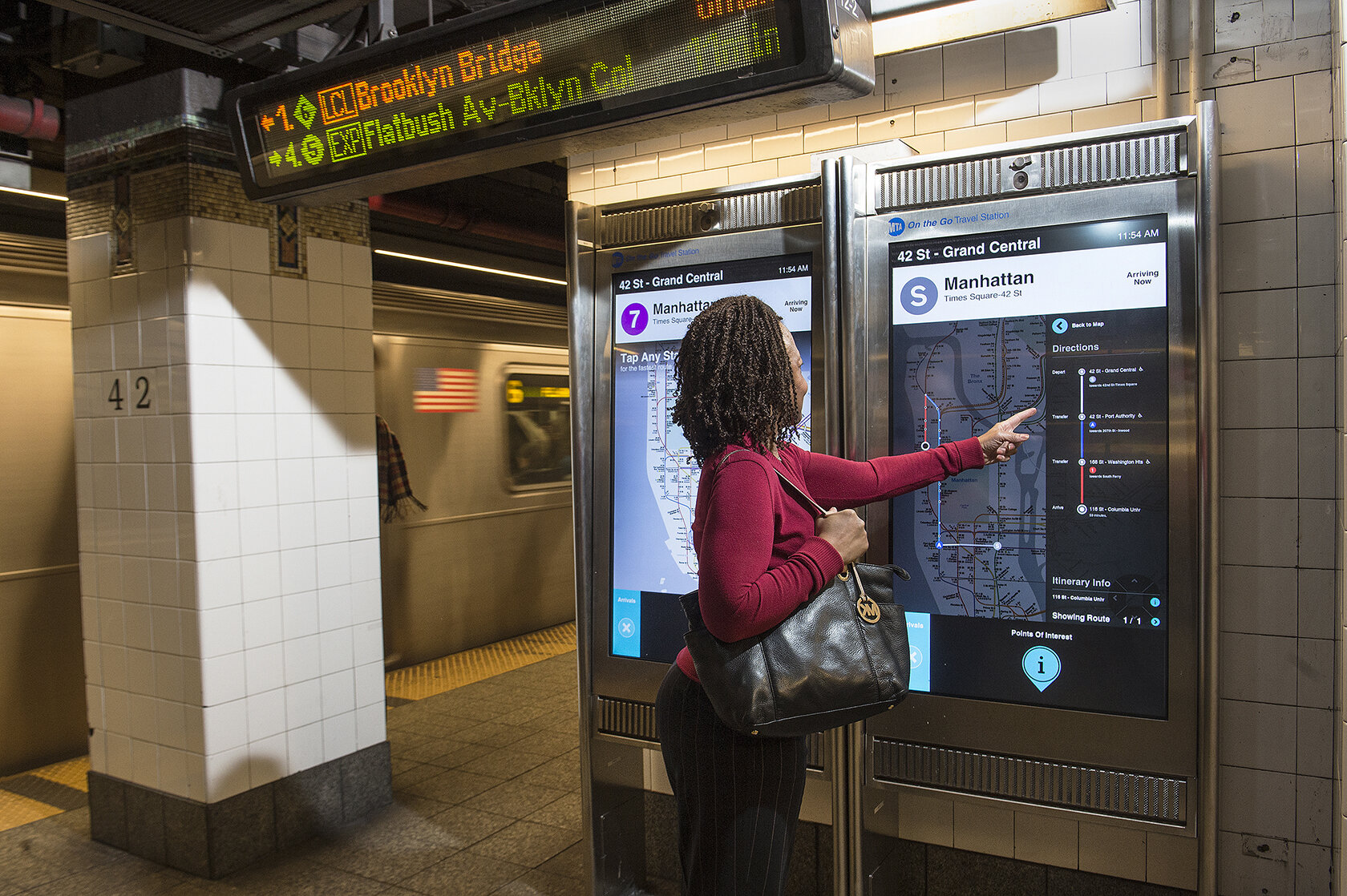
![[mta] MTANYCcontrolgrouponthego42grandcentral.jpg](https://images.squarespace-cdn.com/content/v1/55b3e58ce4b06441e2c709a9/1683048733586-HZ93XCXHG967L6G4YIPS/%5Bmta%5D+MTANYCcontrolgrouponthego42grandcentral.jpg)
MTA On-The-Go Kiosk (Intersection)
Bringing the world’s most famous subway system into modern times
2012-2013
Challenge
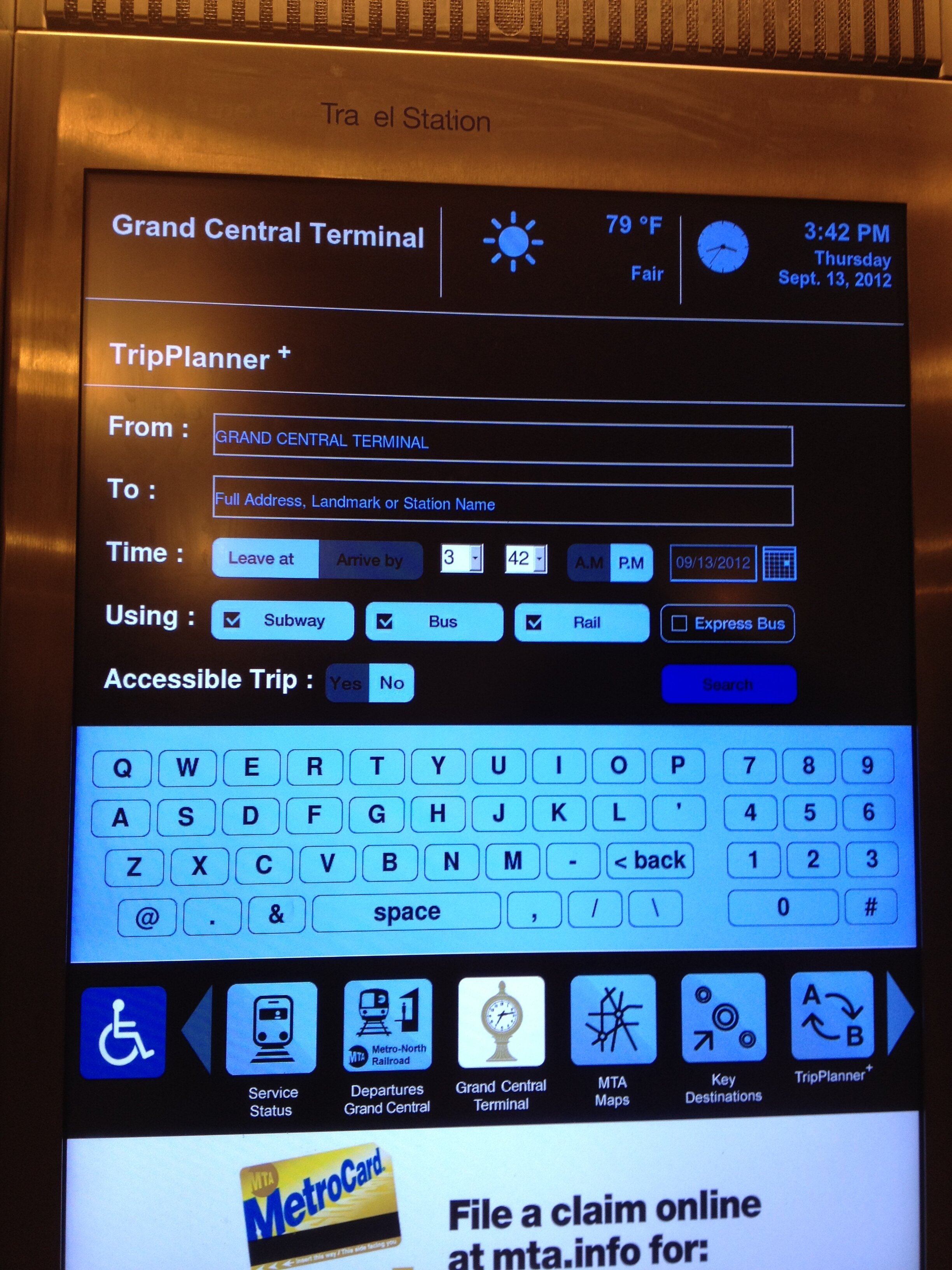
In 2012, the New York City Metropolitan Transit Authority (MTA) was exploring an idea to introduce informational “On-The-Go” Interactive Kiosks as a way to help riders navigate the subway system. The MTA had installed a total of four kiosks across three stations, and had already developed substantial interactive content. However, it was clear that these kiosks were not being used to their full potential. The MTA reached out to Intersection (then, Control Group) to redesign and redevelop the kiosks to better connect subway riders with relevant content.
My Role
As a UX Designer on this project, I initially worked with three other designers to develop concepts for the new kiosk. I led our team on exploratory user research sessions to observe rider behaviors in the subway, and to interact with the existing On-The-Go kiosks to better understand how they were (or were not) being used at the time.
User Research
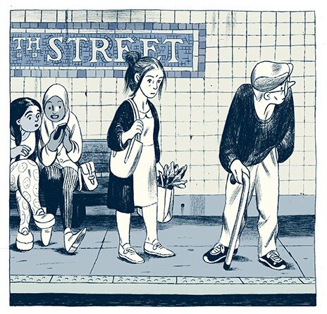
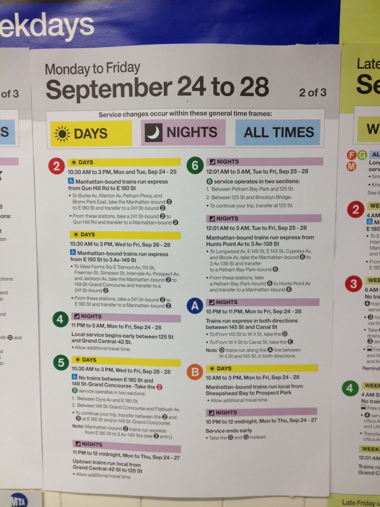
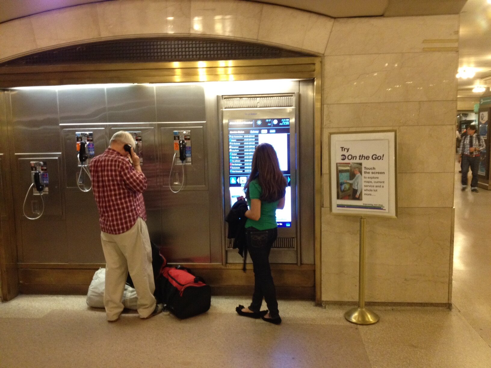
During this user research phase, I learned that the kiosks were generally doing a poor job of illustrating their utility to riders—some kiosks even featured printed signs next to the kiosk that advertised their utility (!). Furthermore, content on the kiosks was not necessarily relevant to where the kiosk was installed (why show train information if those trains do not service this station?). Full keyboards also seemed clumsy and required lots of touching a potentially dirty screen.
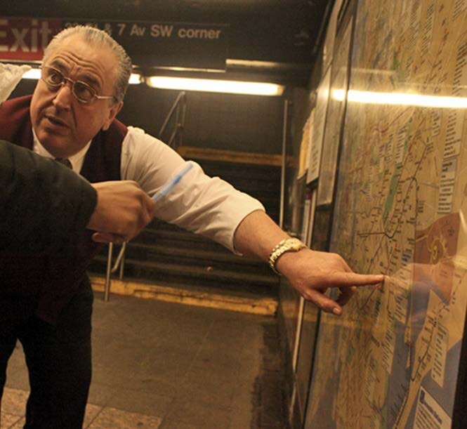
In terms of user behavior, I also observed that, in 2012, the best way to tell when a train would arrive is to lean over the tracks and look for oncoming train headlights. This is dangerous behavior, and I wondered: how might we make design changes that provide a safer, cleaner, more enjoyable experience of waiting for a subway train?
Interaction Design
Emerging from the research phase, I developed the following design principles to help guide our design thinking:
Clear Utility: clearly communicate the kiosk’s value to all riders.
Minimum Interaction: surface valuable information with as little interaction as possible.
Contextual Content: only the information you need, when you need it.
Led by our design director, our team also developed archetypes for the types of riders we wanted to reach, based on their level of confidence with the subway system:
Tourists—potential first time users with generally low confidence;
Commuters—daily riders who follow a routine
Off-Routine Riders—those with generally high confidence in their abilities to get around on the subway, but may need confirmation for one-off errands around town.
The idea of “Contextual Content”
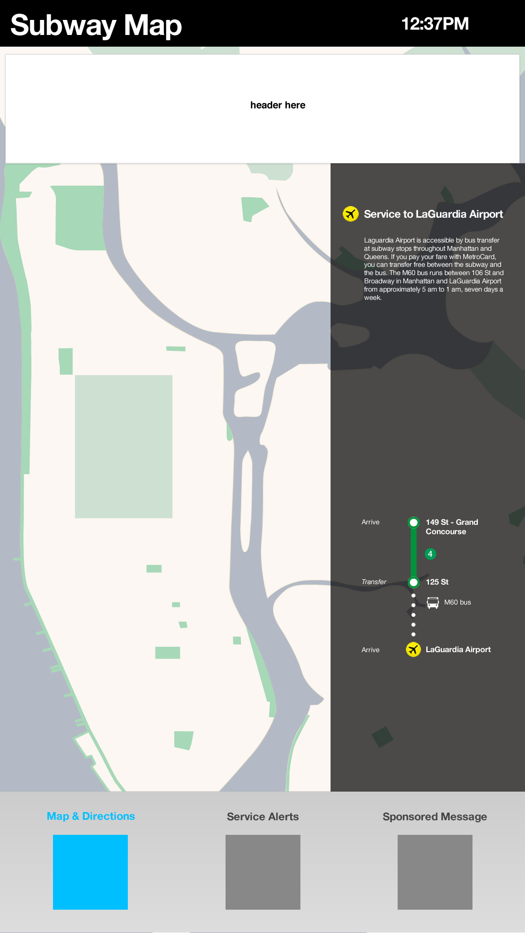
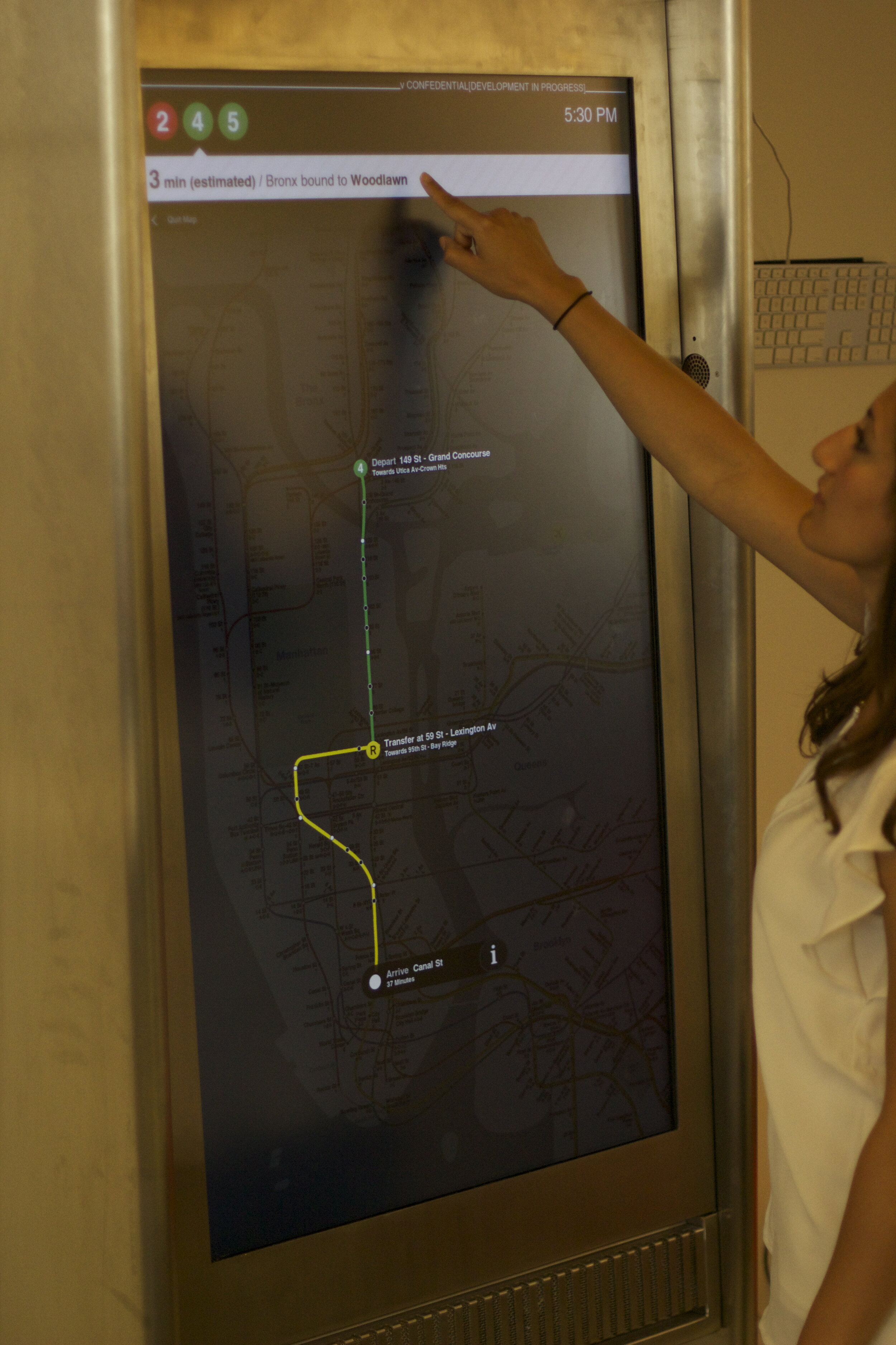
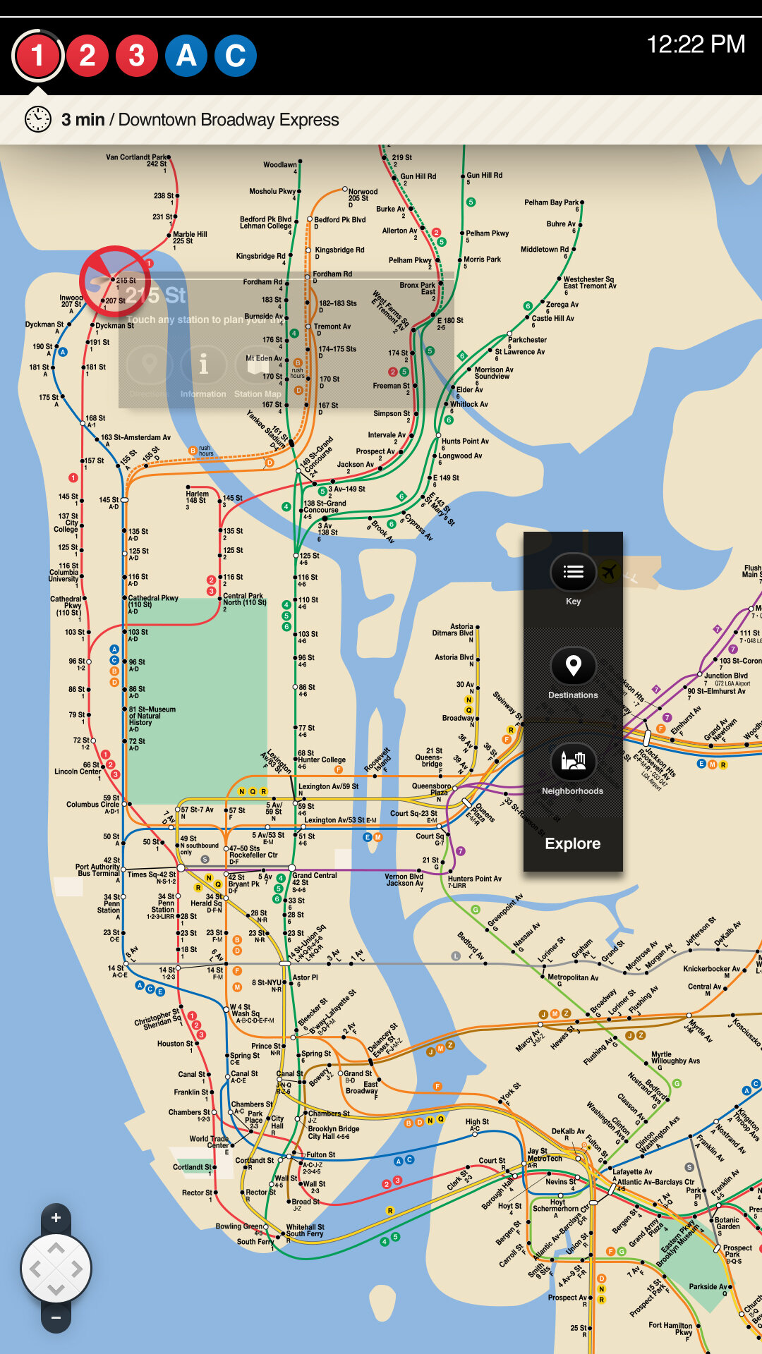
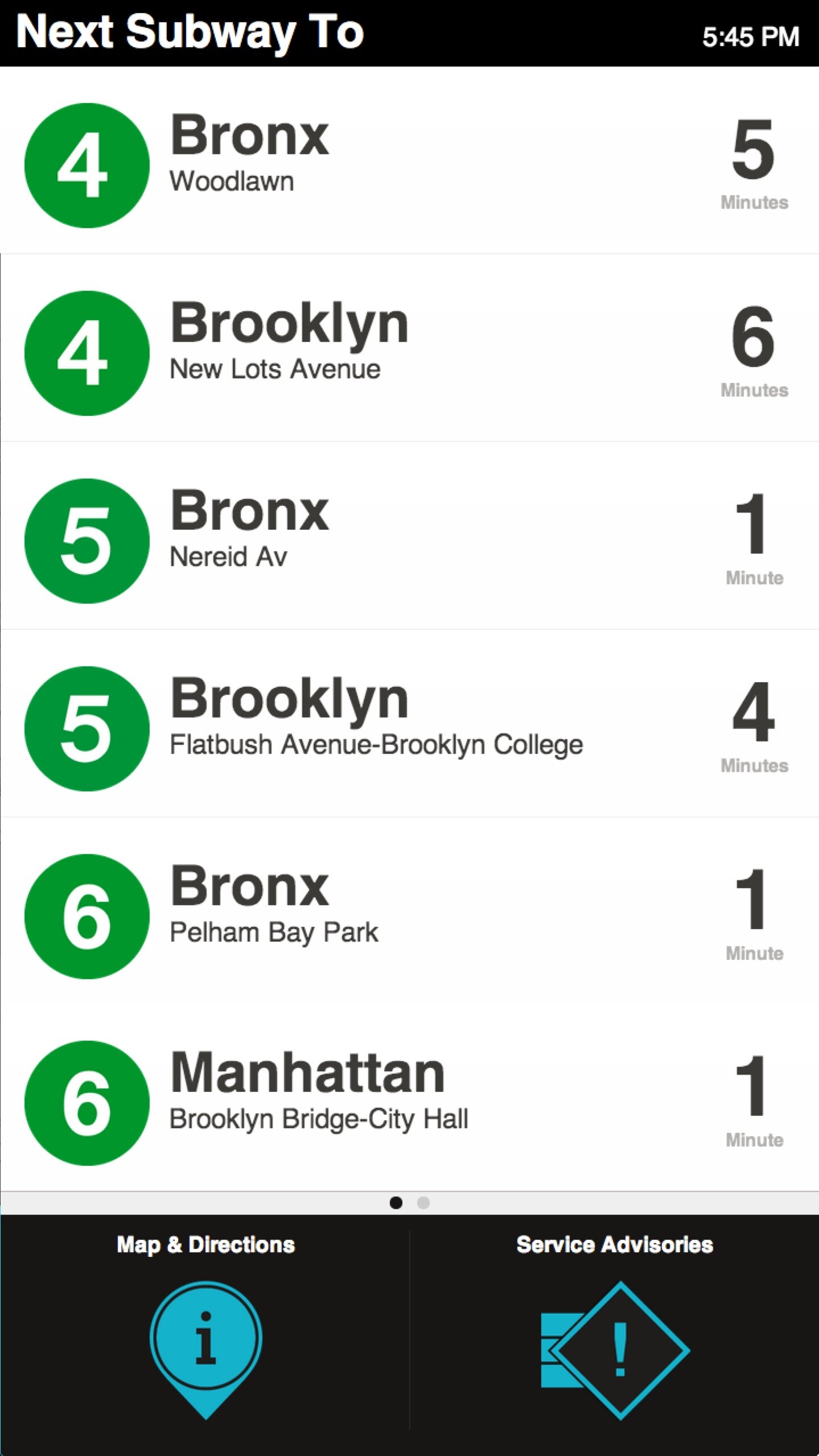
Combining these principles together with our archetypes, I developed an interaction framework that completely changed how our team thought about the design of the kiosk. My idea was to deliver real-time, location-specific transit content, and filter out all information that’s not relevant to the user in that location. This means each kiosk delivers train arrival information and service interruptions specific to its exact location within a station, which means that kiosks installed on different platforms within the same station may deliver different information if those platforms are serviced by different trains. This was a groundbreaking idea at the time; this vision was adopted by senior stakeholders, eagerly shared with the MTA, and positioned our team to win the bid.
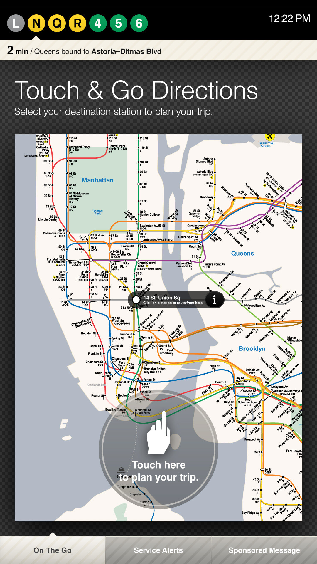
Visual Wayshowing
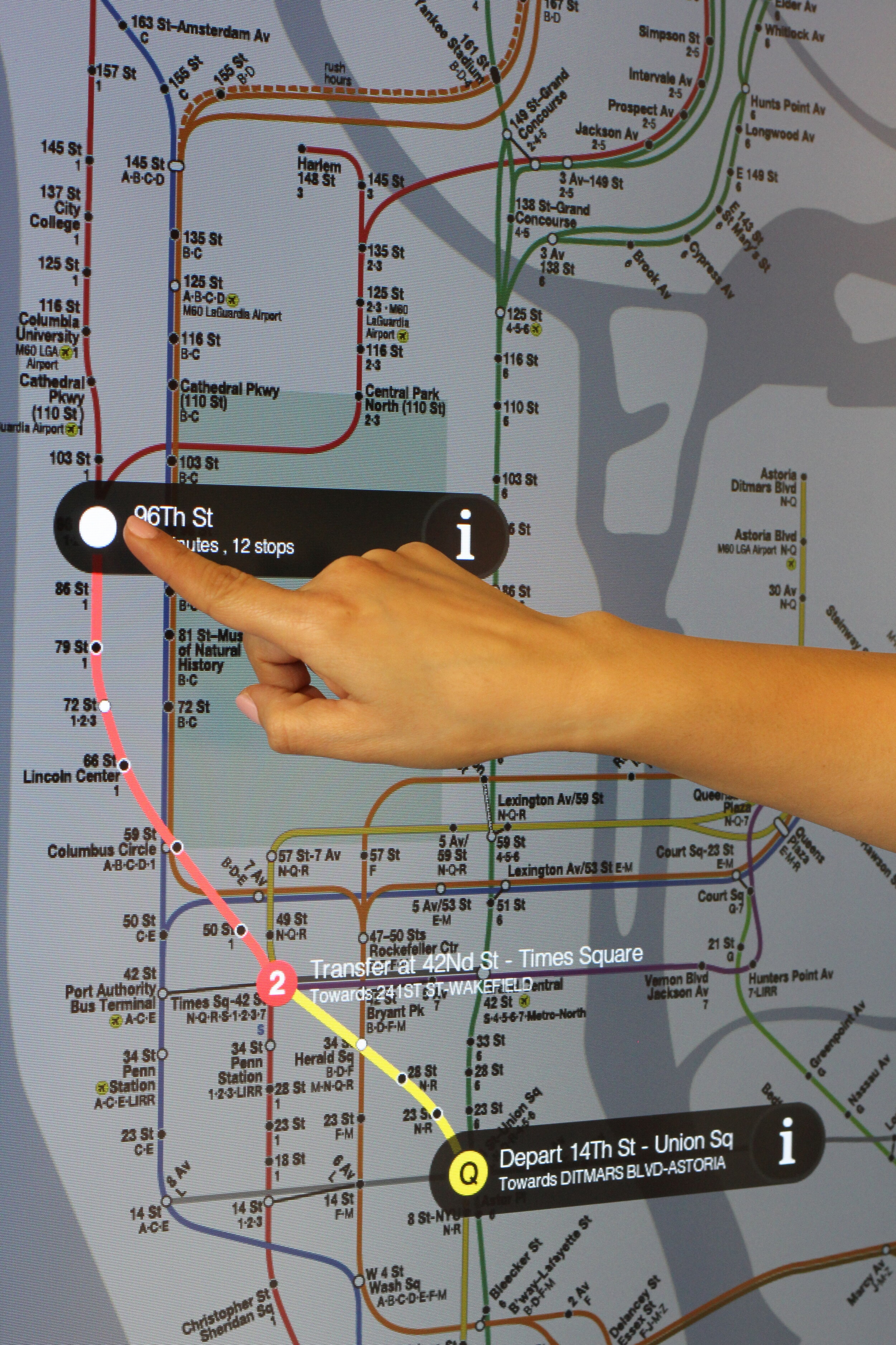
I also developed a unique, map-based, one-touch wayshowing interaction pattern. By turning the iconic NYC Subway Map into a wayshowing tool, a user merely has to tap her destination on the interactive map to see an optimized route animate to the destination. This route uses real-time train information to display the fastest route, and incorporates service interruptions.


Prototyping & Design
These interaction concepts I developed combined into a winning design. I led our team through many rounds of prototyping the specific interaction patterns, some more successful than others. We also introduced a powerful advertising platform that would keep this kiosk sustainable and generate revenue for the MTA.
Results:
The On-The-Go kiosk was a smashing success for Control Group, and established our company as a serious player in Smart Cities design and technology. As of 2018, more than 120 On-The-Go kiosks had been installed throughout the NYC MTA subway system. The network of kiosks boasted over 1.3M users and generated over 5 million impressions each month. Moreover, the success of the On-The-Go kiosk paved the way for future smart cities contracts, specifically LinkNYC (and similarly-designed transit kiosks installed in other cities around the world). These products eventually led to Control Group’s acquisition by Google’s Sidewalk Labs in 2015, cementing our team’s expertise in experiential DOOH platforms.
🏆
Communication Arts Interactive 2015 - Winner, Environmental
SXSW Interactive 2015 - Finalist, Innovation
Digital Signage Expo APEX 2015 - Bronze Winner, Installation
Society for Experimental Graphic Design 2015 - Winner, Top 20 Wayfinding Projects
Referenced in Wayshowing > Wayfinding (BIS Publishers, 2013)
For more, see coverage in Fast Co., Gizmodo, and Mashable (video).
“An interface that puts Google Maps to shame.”