
Zoox
Accelerating the arrival of fully autonomous mobility.
2018-2020
Zoox is a major challenger in the Autonomous Vehicle space, and, as an Amazon company, is peers with companies like Waymo (Alphabet) and Cruise (GM).
As a Senior UX Designer focused primarily on Operational Tools (with the occasional assist in Rider experience and service launch strategy), I worked closely with a Product Manager, a contract UI Designer, and a UX Researcher to make improvements to existing internal tools, lead the design of new game-changing features, and build new operational tools as needed. Working on operational tools required extensive cross-functional collaboration with many different teams, including different user groups, multiple TPMs and multiple development teams concurrently. Given that Zoox is in a race to deliver on the promise of autonomous mobility with powerful competitors, I considered our Ops Design team’s mission to optimize our operational toolset for a strategic advantage against our competitors.
Public glimpses of CoreDash, TeleDash, and DemoDash, all of which I worked on while at Zoox.
Case Study: CoreDash “Notetaker” feature upgrade
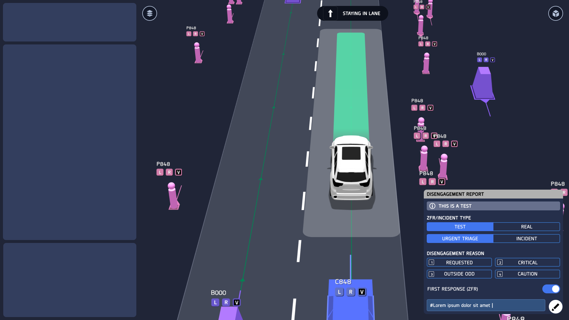
In the process of training an autonomous vehicle, Zoox AI-enabled test vehicles drive 16 hours a day around San Francisco while being monitored in-vehicle by specially trained vehicle operators, which we called “Alpha Operators.” The role of the Alpha Operator (“AO”) is to monitor the test vehicle while it autonomously drives to test the latest iterations of AI software, and to collect data about the surrounding environment. For example, if the test vehicle runs into an unexpected obstacle in the course of daily driving, like a construction site, then the AI might “disengage” (meaning, turn off), which leaves control of the vehicle in the hands of the Alpha Operators (pictured below).
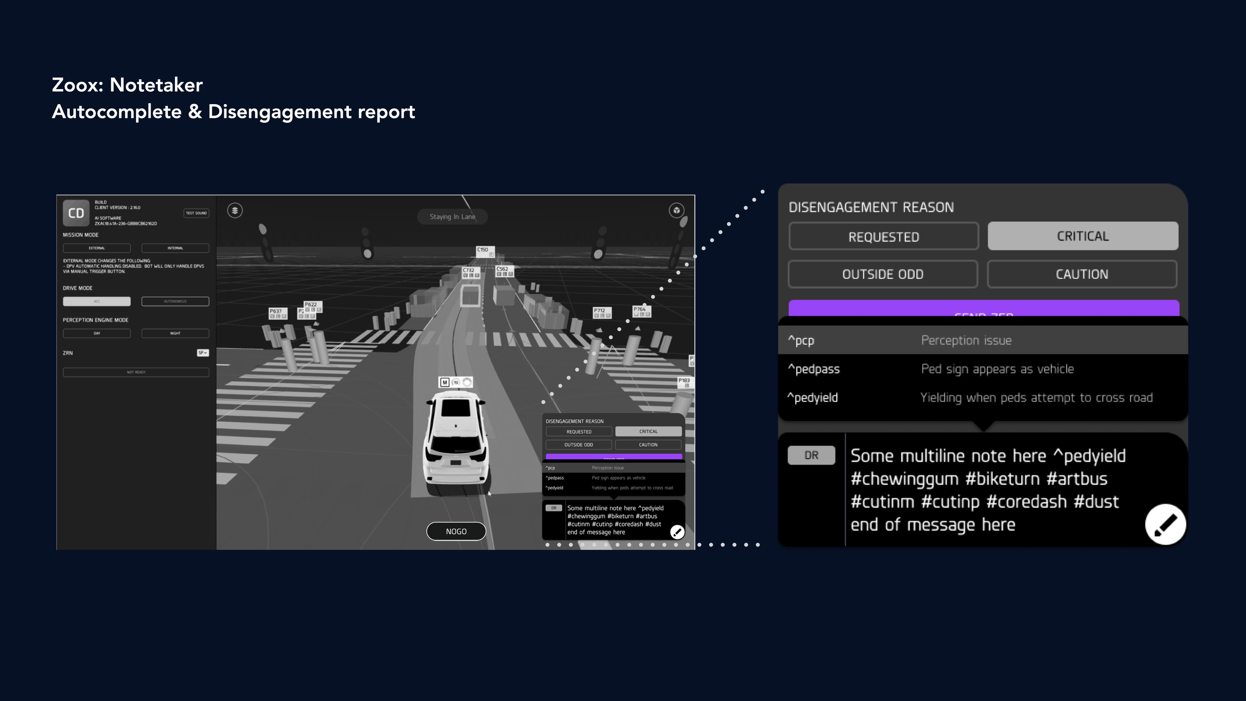
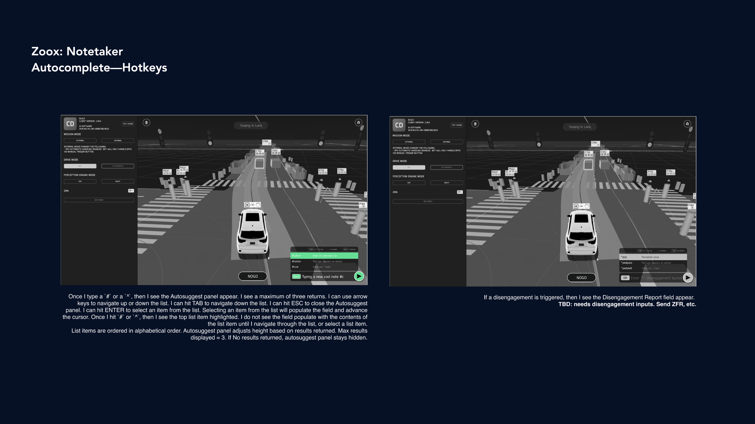
The AI’s view of the world is featured on the screen in the vehicle, a surface we called “CoreDash.” CoreDash features a rich, 3D environment that reflects the vehicle’s perception of the surrounding area, giving the AO’s an understanding of what the vehicle’s sensors see. CoreDash makes it easy for AO’s to reconcile the vehicle’s understanding of the surroundings with the actual surroundings around the vehicle.
This is where Notetaker comes in. Notetaker is a feature within CoreDash that is intended for AO’s to take notes on vehicle behavior as it pertains to the real world. For example, if the vehicle brakes erratically for pedestrians in a crosswalk, it’s the AO’s responsibility to capture that note in Notetaker so the AI engineers can successfully triage that bug (an example note for this behavior might be, ““#braketap for #ped in #crosswalk””). Needless to say, Notetaker is an extremely important feature, so speed and accuracy are key in developing this tool.

A view of CoreDash. The original Notetaker is in the bottom right. A disengagement report is featured on the left.
Challenge:
When I started this project, Notetaker was simply a text field in the bottom right-hand side of the screen, with an “enter” button. It was developed entirely by (very busy) engineers with no design input. This feature upgrade had three goals:
Integrate the Disengagement report and introduce a NoGo report
Balance three different text input fields (Notes, Disengagement Reports, and NoGo reports)
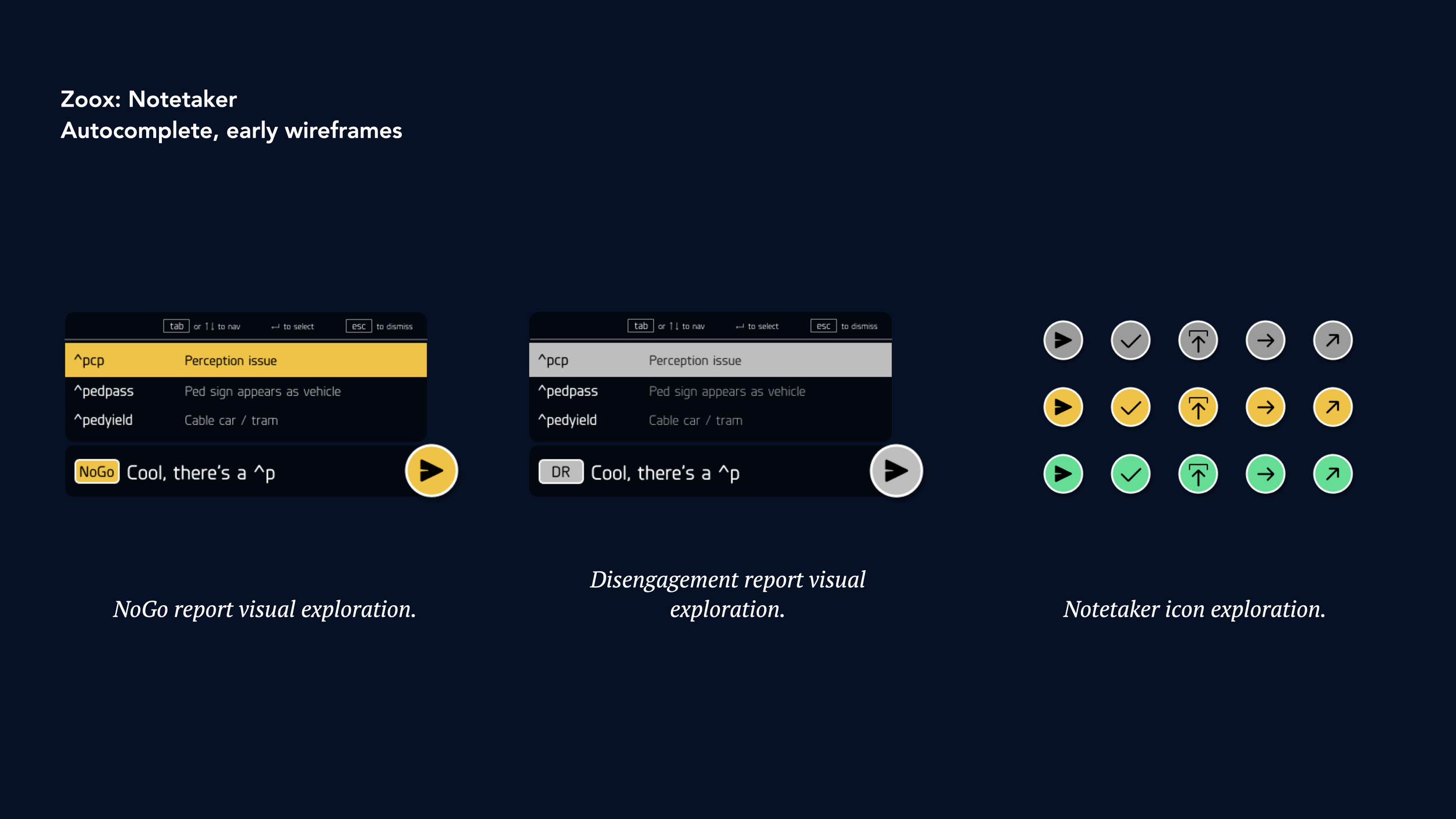
Introduce hashtag autocomplete
This challenge was especially tricky, given our practical constraints:
Difficult in-vehicle keyboard & trackpad setup
Balancing speed & visibility in a tight space; making sure to leave room for the 3D coredash content space (which we called “X-Ray”).
How might we elevate Notetaker from a simple input field to a complex, fleshed out feature, and do so while economizing screen real estate and accounting for limitations around our in-vehicle keyboard/trackpad?
Early sketching & design iteration
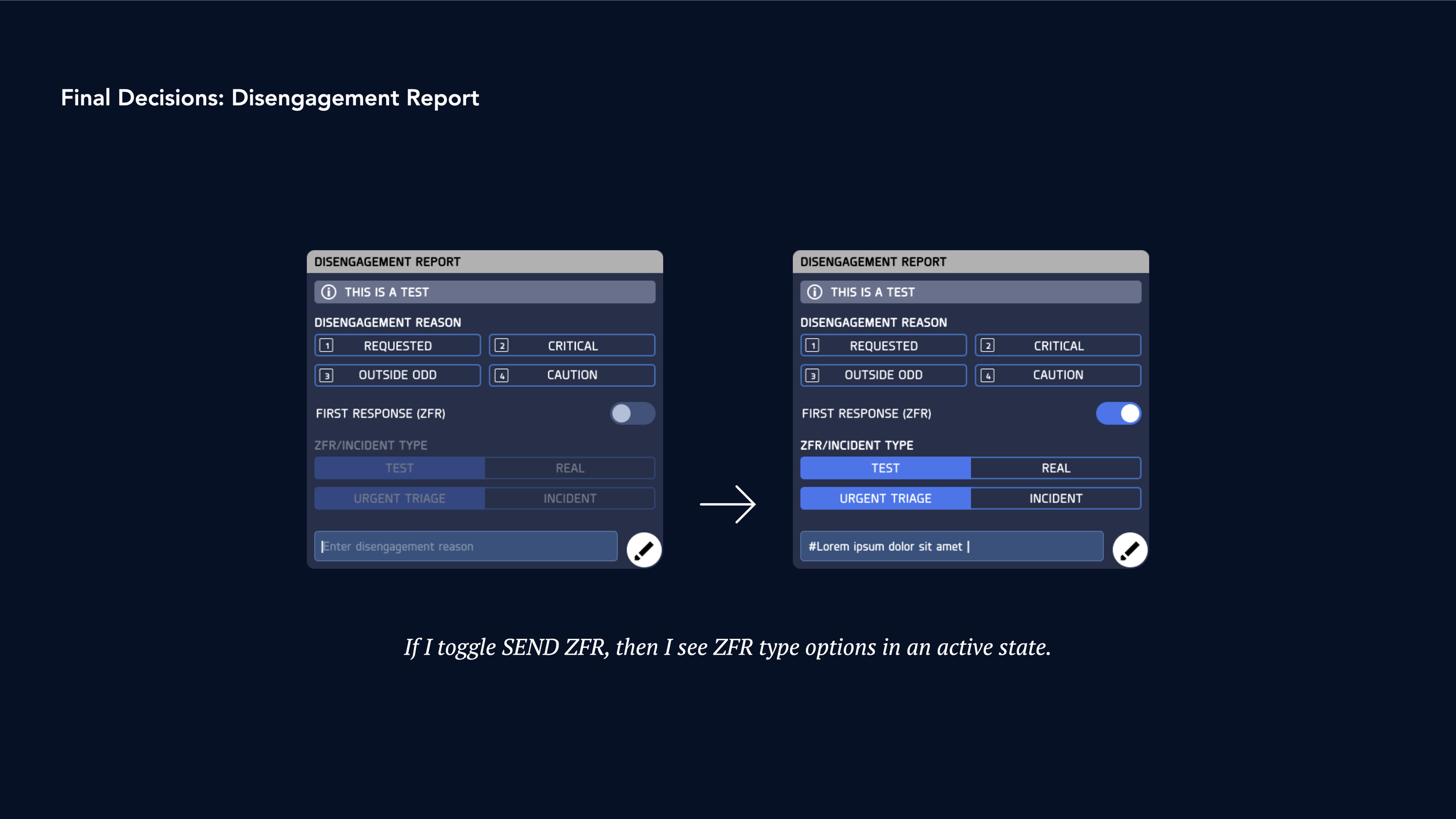
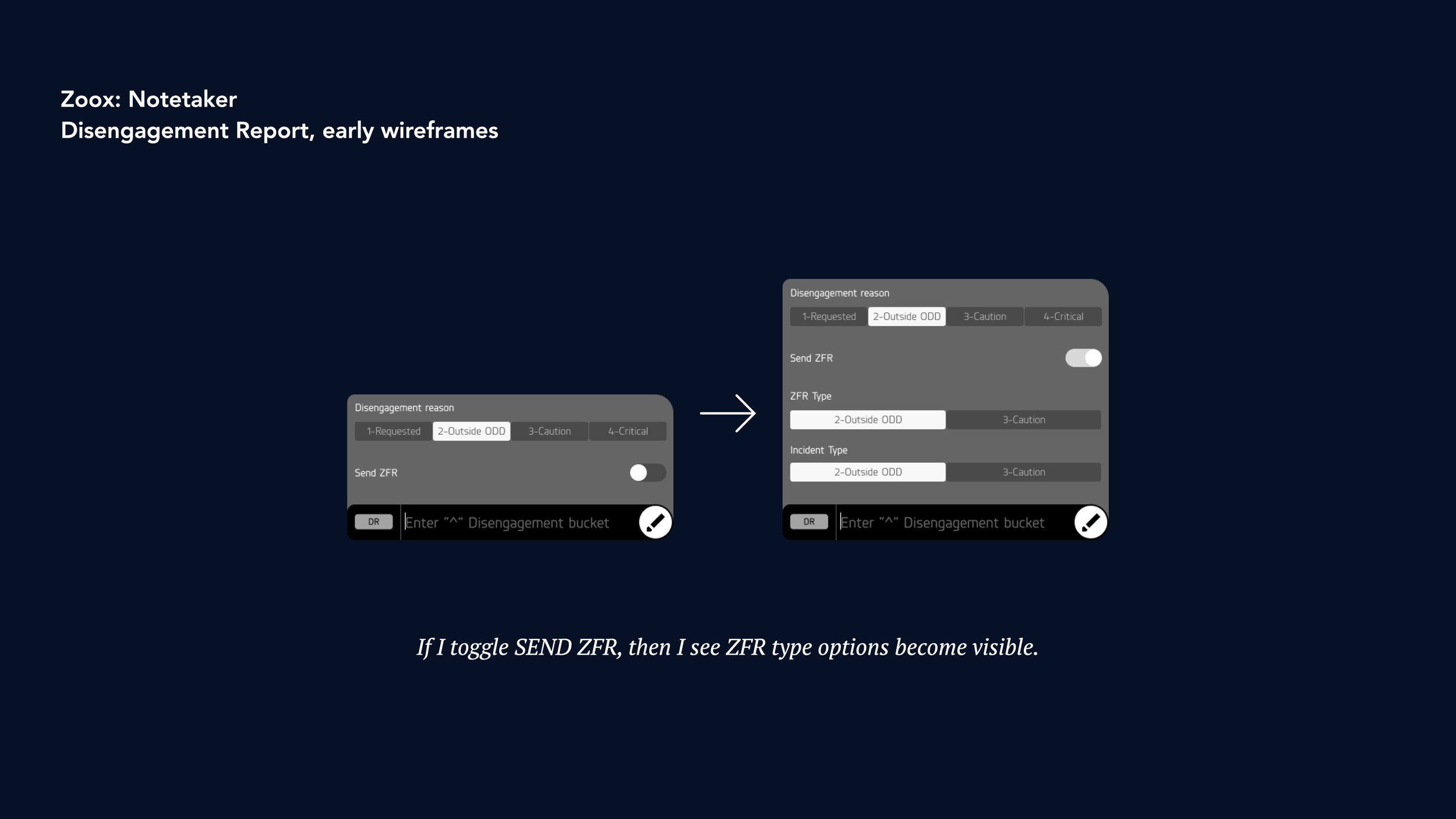
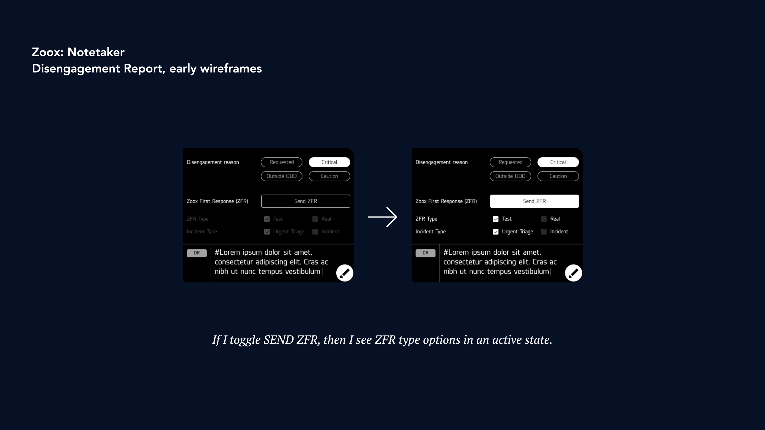
Goal 1: Integrating Disengagement Reports and Operator NoGo’s
To address this, our team started to explore a contextual tray pull-up menu. If a Disengagement was triggered, or a NoGo initiated, this tray would automatically pull up to reveal quick options that our AO’s could then use to capture the reasons for that Disengagement or NoGo.
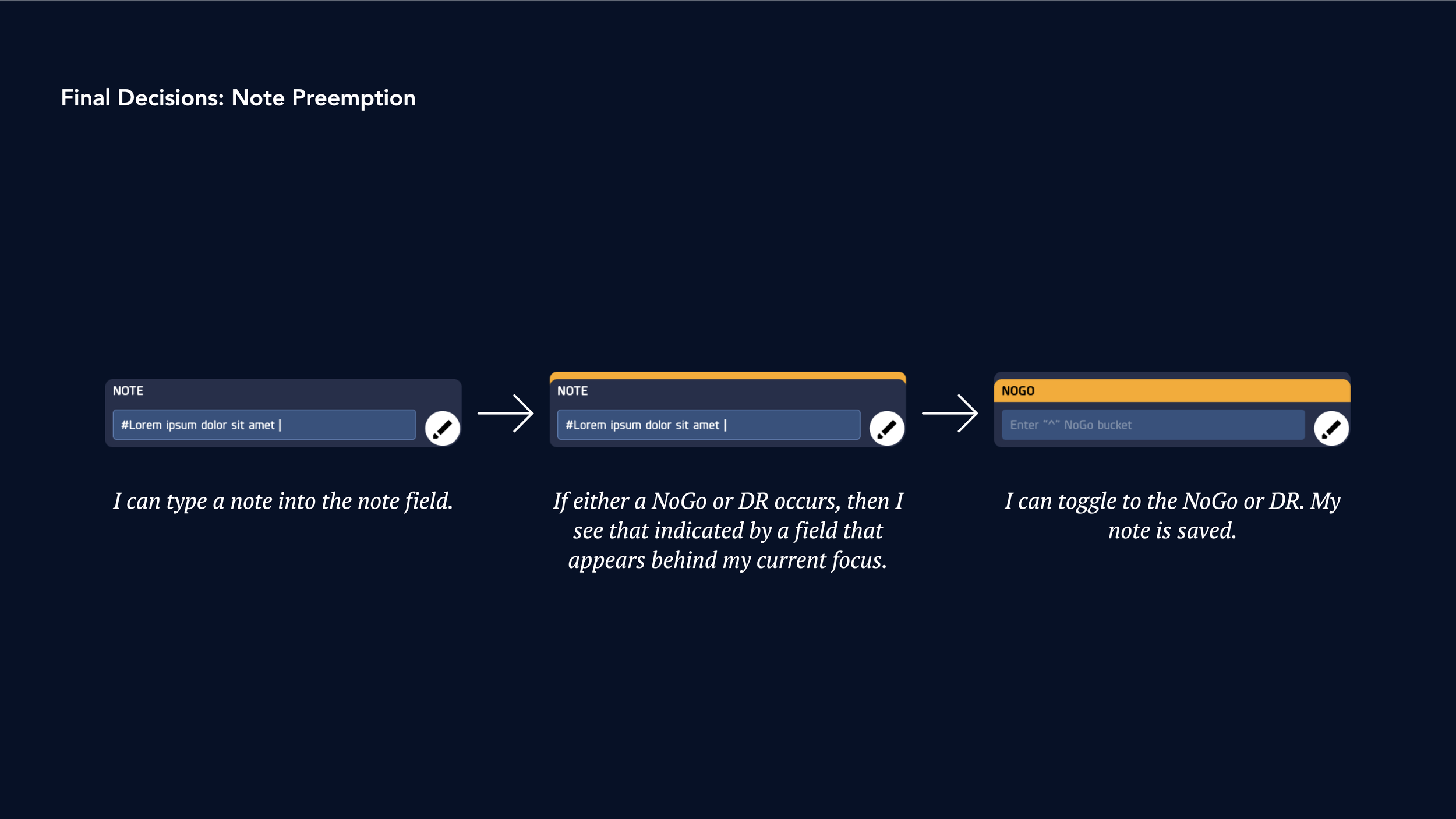
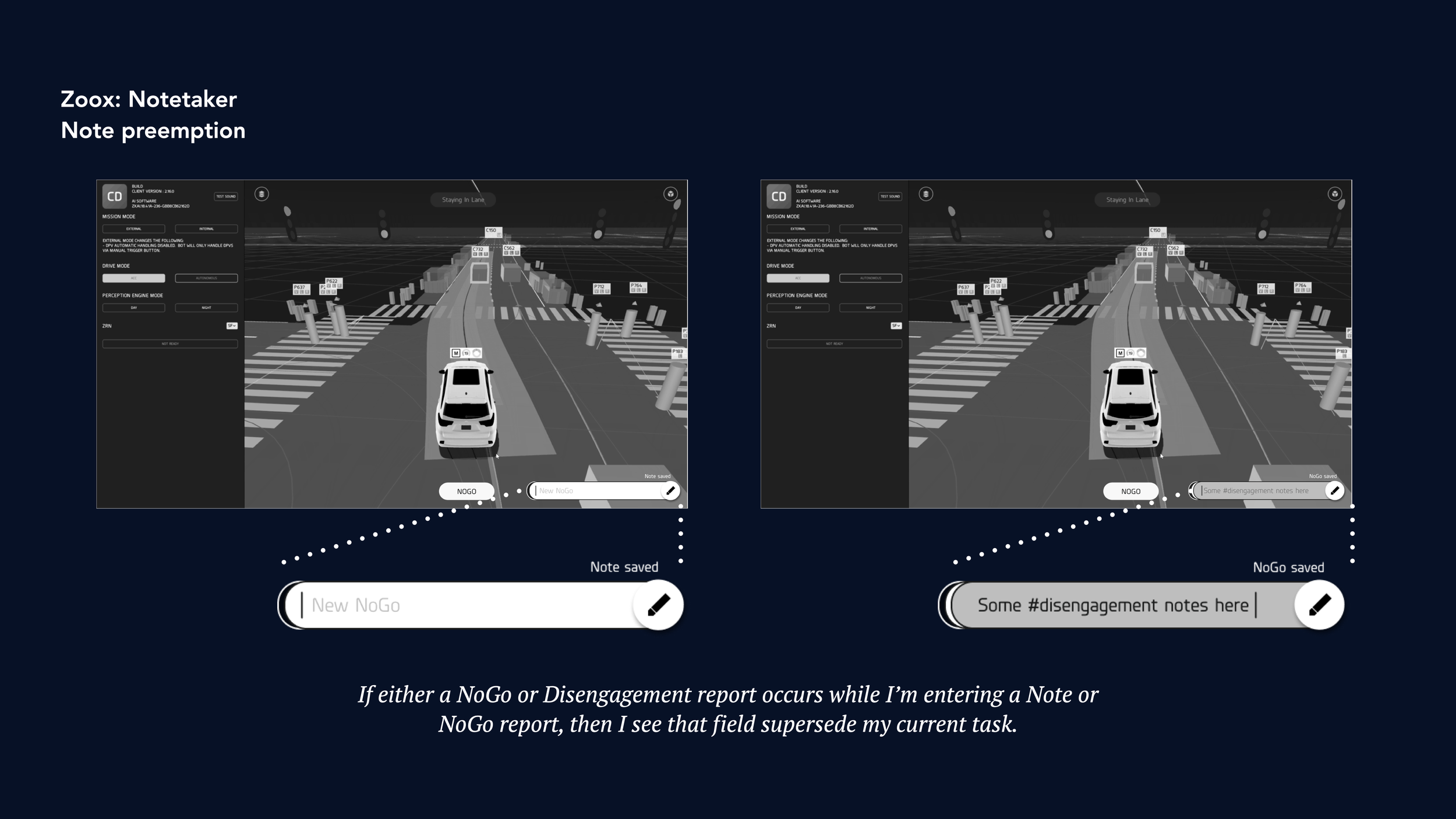
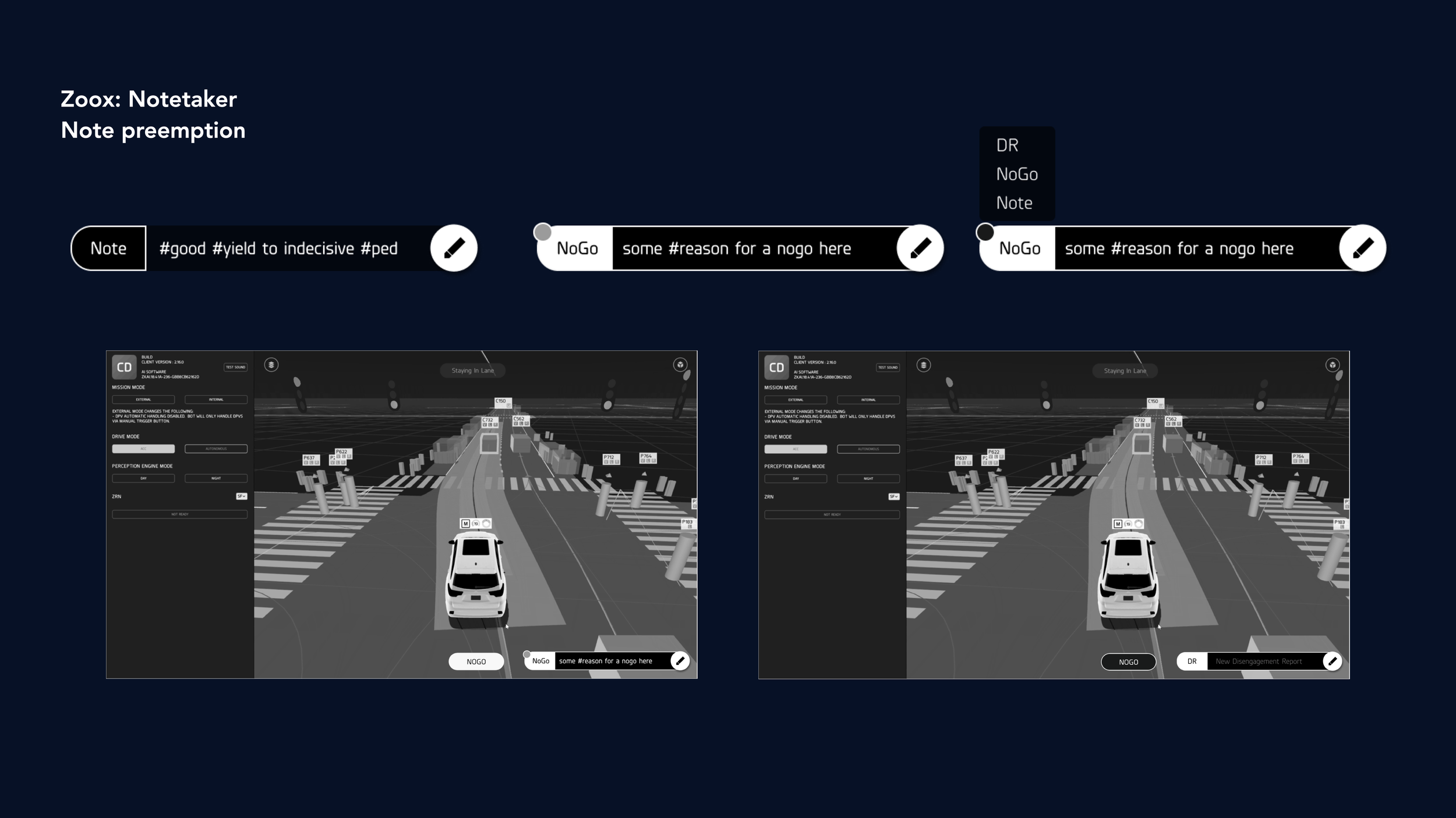
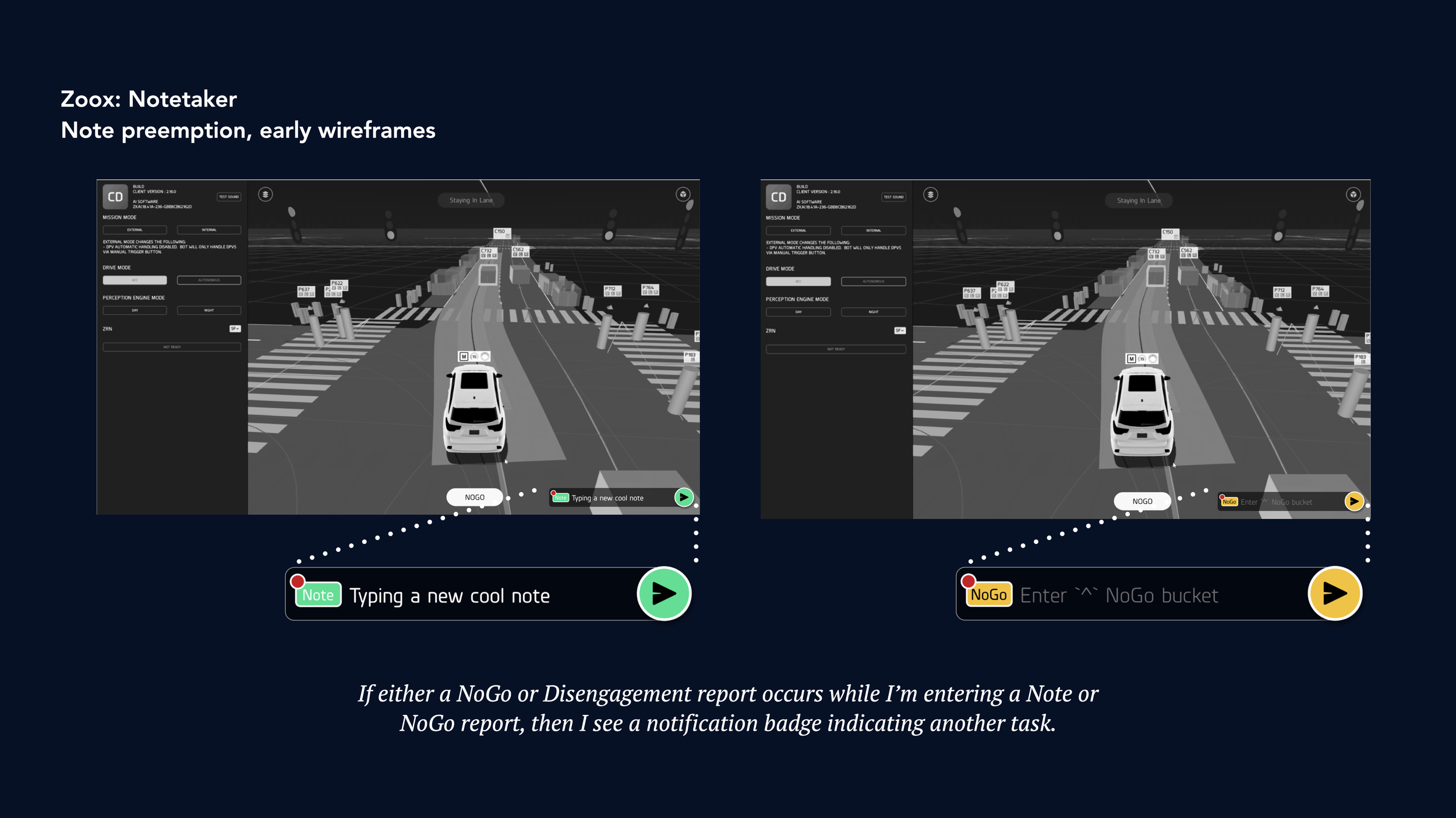
Goal 2: Balancing text input fields / “Note Preemption”
Another challenge was how to manage three discreet text fields within a constrained module on CoreDash, in a way that we came to call “note preemption”. Early explorations included stacking the text fields, introducing a pull-up menu to choose between different fields, and introducing a tabular architecture to choose between different fields. Each had their merits which we discovered after testing with users.
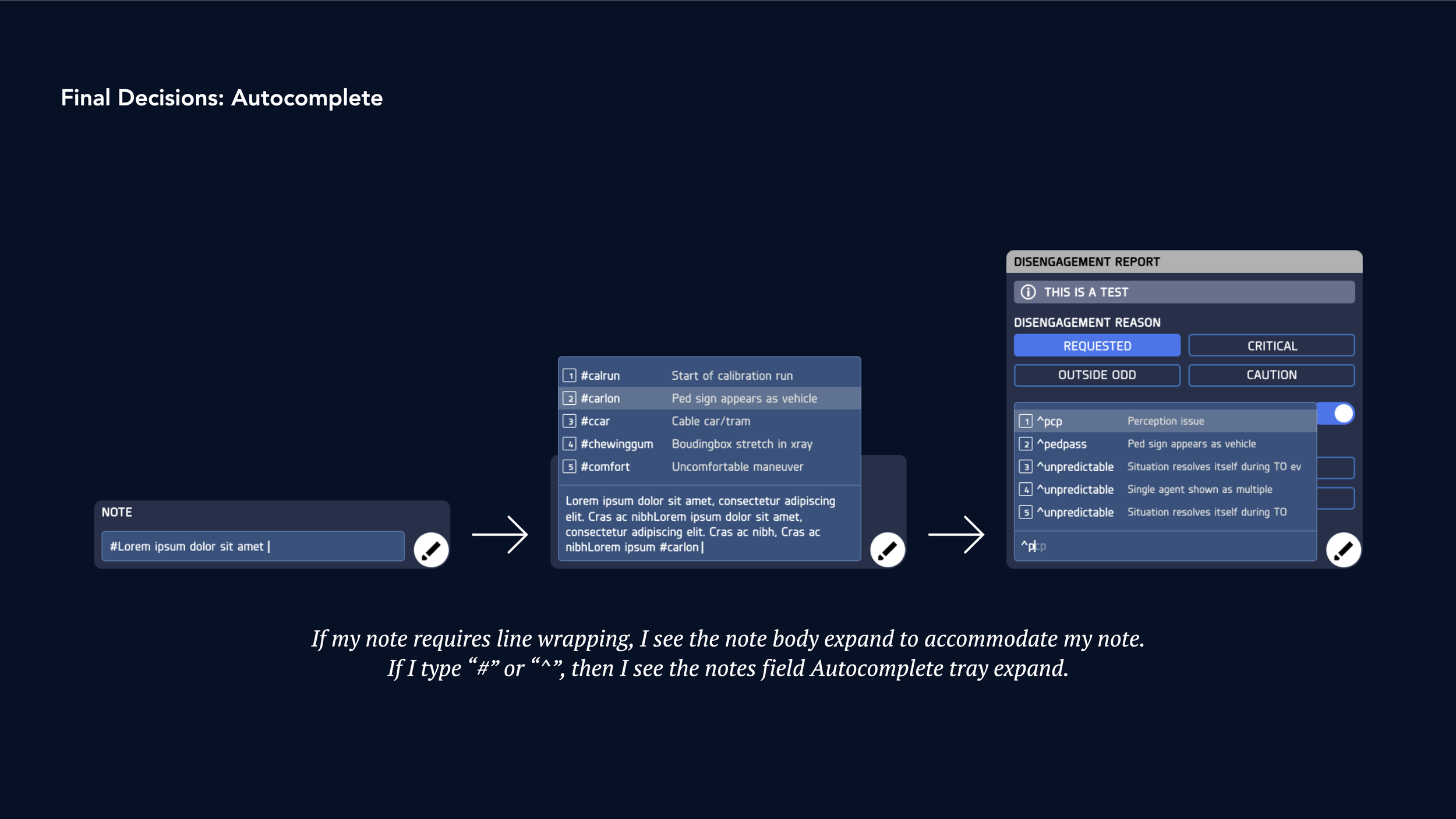
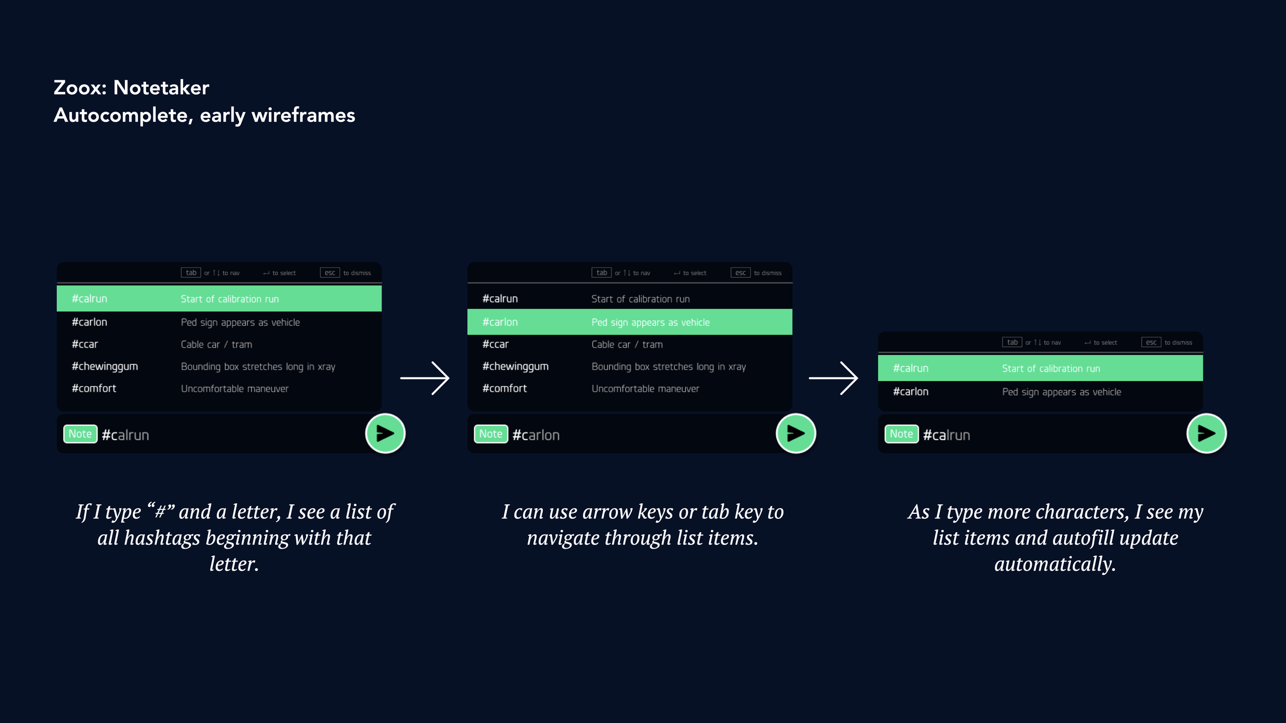
Goal 3: Autocomplete
Finally, how might we make it easier to enter hashtags? As it stood, AO’s needed to memorize 119 different hashtags for different situations, which is an added pressure in an already fast-paced role. We explored different options for how we might communicate text autocomplete, including exploring in-field completion and introducing a pop-up to make hashtags more visible. We also explored keyboard shortcuts (like using tab or arrow keys to navigate results) to make targeting a desired hashtag much easier than using the cumbersome keyboard trackpad.
Final Designs & Results
Our UI designer and I iterated on these designs and tested with AO’s throughout or design cycle. We applied our emerging design library and explored input methods along the way. Eventually, we landed on a final design that seamlessly integrated each new feature into a robust new version of Notetaker that met all of our goals. Notetaker went on to become one of the most appreciated features released for CoreDash in 2019, praised especially for use of hotkeys and autocomplete.